
South East Asia Music Institute (SEAMI)
Project: Editorial
Role: Design, Art direction, Development

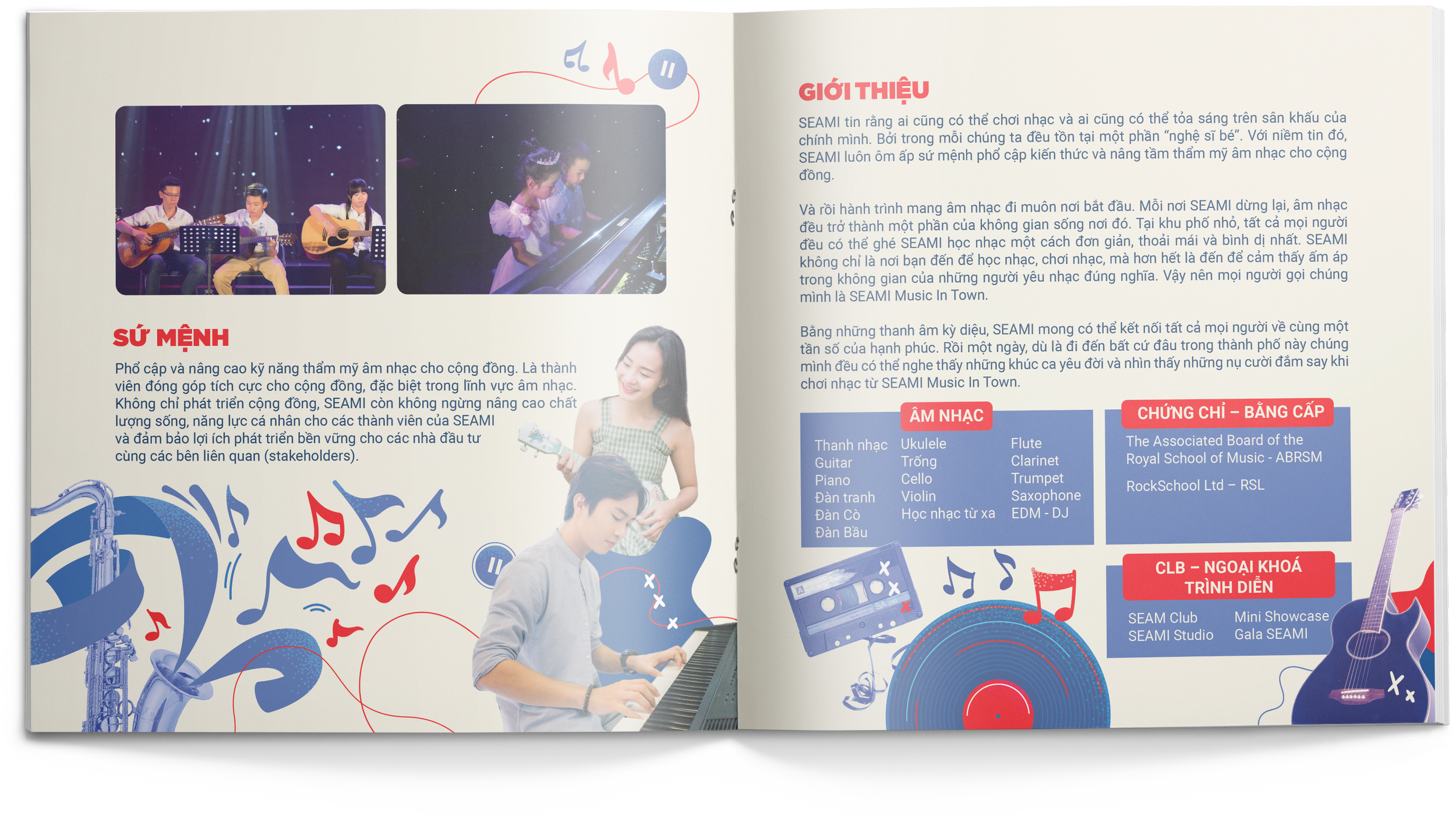
I had the joy of creating a brochure for SEAMI, short for South East Asia Music Institute. This groundbreaking music education hub is all about spreading knowledge and enriching the musical culture of the community. The brochure highlights SEAMI's programs and services while giving a glimpse into the institute's values, philosophy, and approach to music education.

The Idea
For the brochure, I aimed to craft an immersive experience reminiscent of the nostalgia and warmth of listening to a vinyl record. I incorporated design elements like circular shapes and grooves to mimic the look and feel of a vinyl, evoking a sense of familiarity and comfort for readers.
SEAMI isn't just about music education—it's a community spreading happiness and enriching lives through their programs. My goal with the brochure was to capture this essence and inspire others to join in.


The process
I infused music festival elements like confetti, music notes, and ribbons, along with images of instruments, into the brochure. This gave it a vibe akin to a vinyl record and stirred up the sensation of being at a lively festival.


The colours
Throughout the brochure design, I utilised lighter shades of blue and red, in line with the brand's colors, to maintain consistency and reinforce its identity.

The illustrations
I incorporated festival elements, shapes, and music notes to capture the vibrant essence of a music festival, adding a dynamic touch to the overall design.