
United Pals
Project: Branding
Client: United Pals
Role: Art direction, Graphic and Web Design

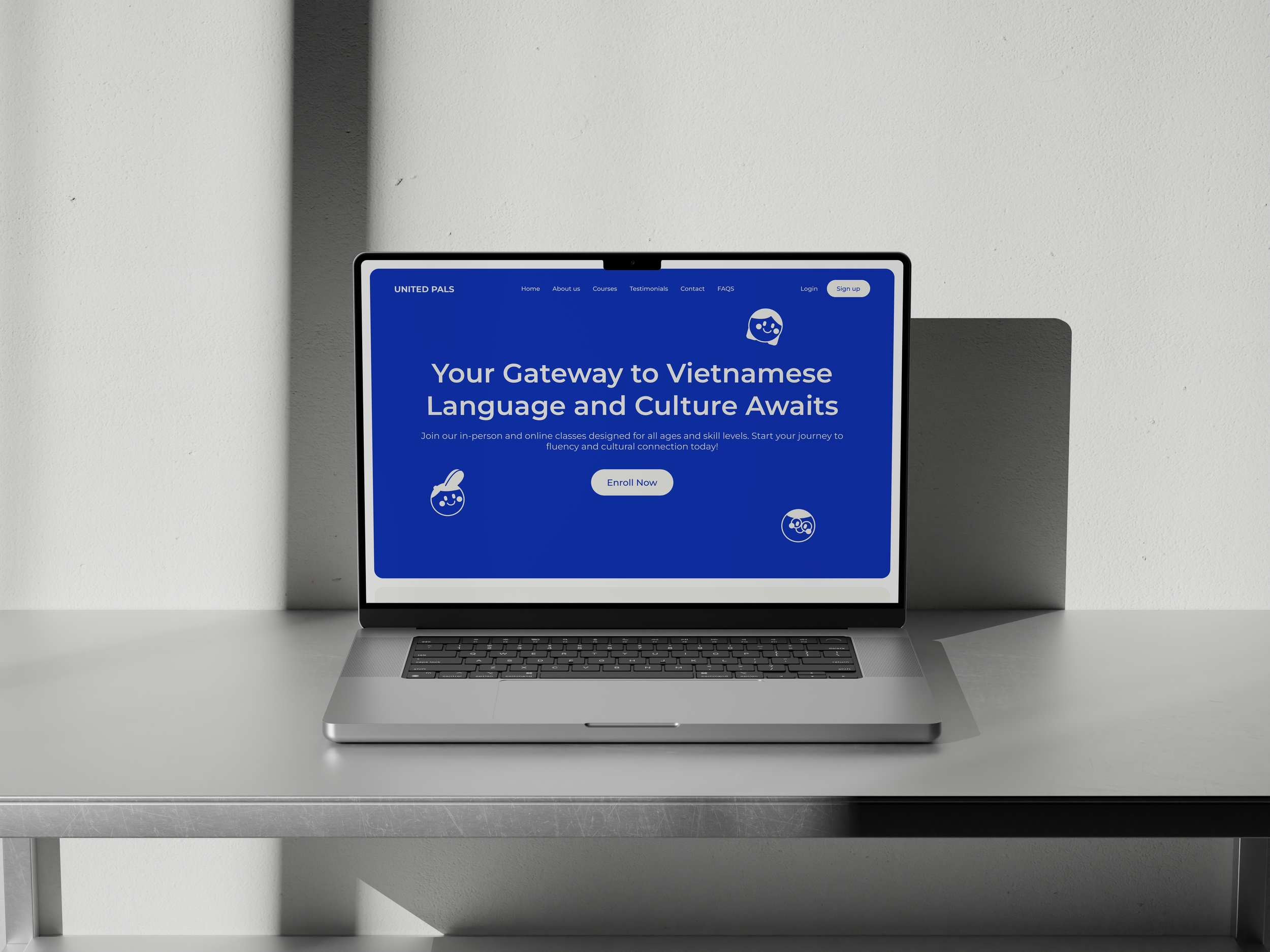
United Pals is a Vietnamese language learning initiative that aims to create a friendly, engaging environment for students. The brand's visual identity, as shown in the image, features a cheerful blue and white color scheme with cartoon-style icons representing diverse learners.

The Idea
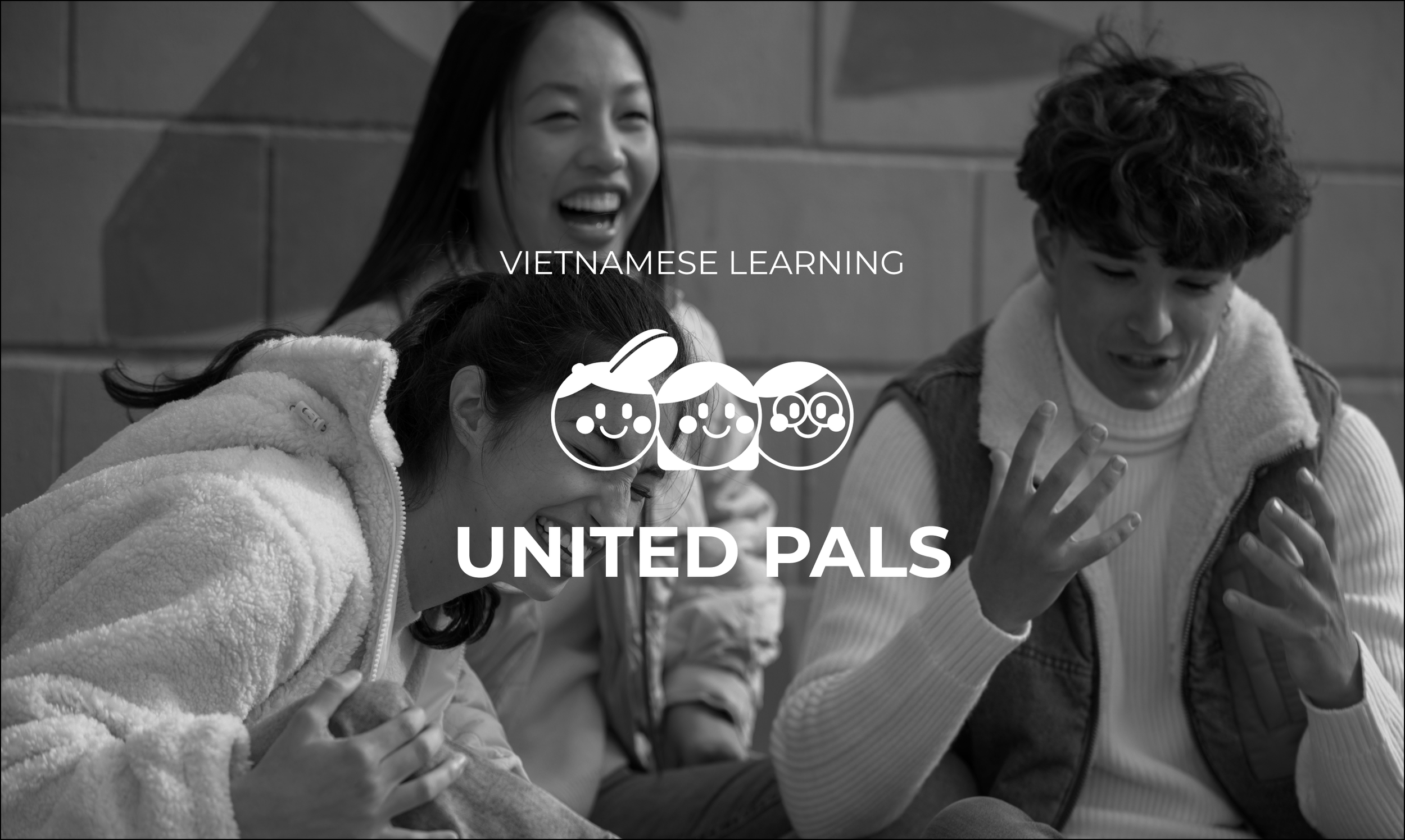
The logo depicts three smiling face icons side-by-side, symbolising community, friendship, and collaborative learning. Each face has distinct characteristics - one wears a hat, another has longer hair, and the third wears glasses - representing the diversity of learners united by their shared goal of mastering Vietnamese.

The colours
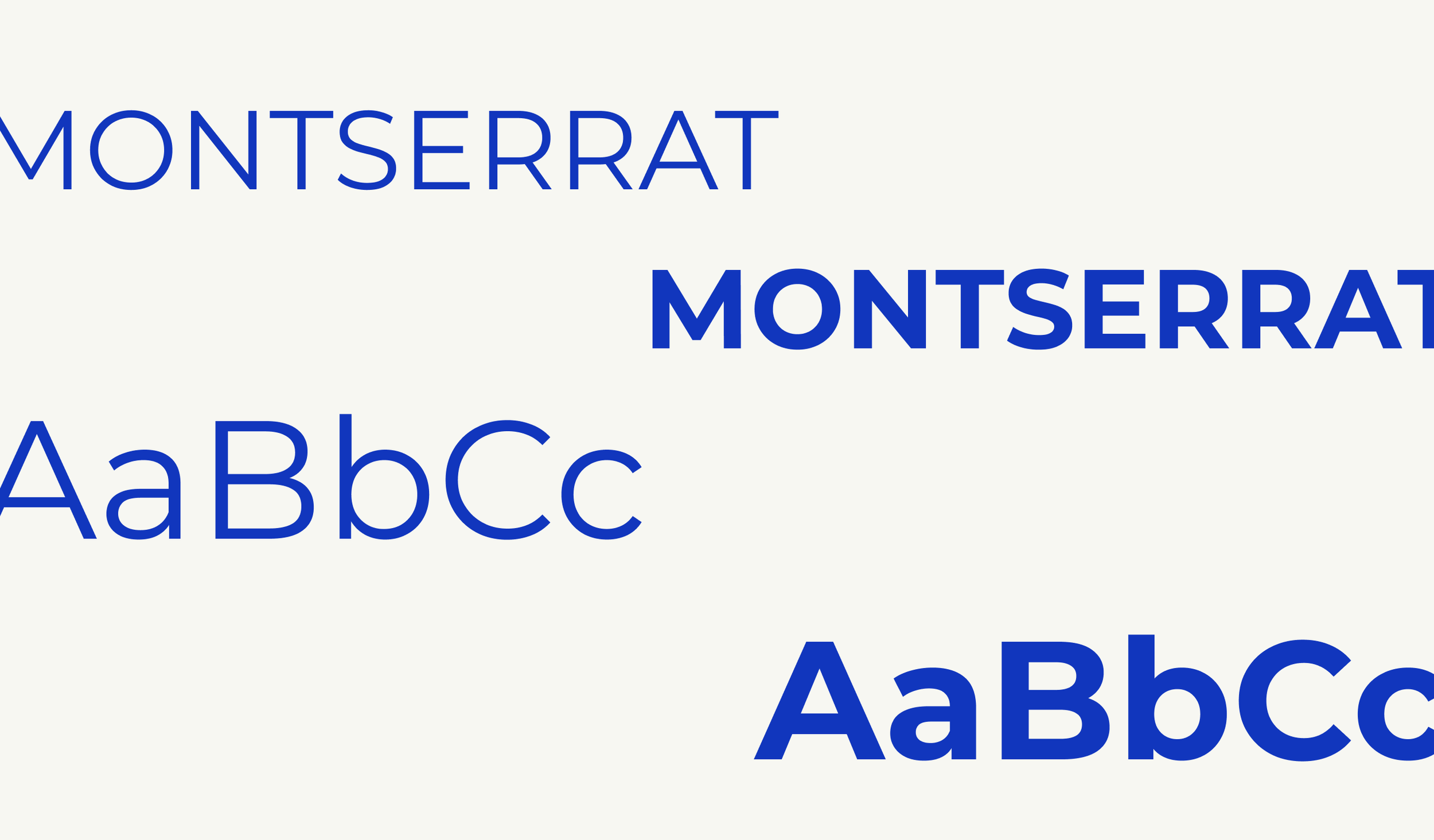
The playful, approachable design aligns with United Pals' mission to make language learning fun and accessible. The bright blue color conveys trust, knowledge, and calm, while the simple geometric shapes and clean typography create a modern, appealing aesthetic.
To further reinforce the brand identity, I drew inspiration from the three heads in the logo to create three circles. These circles symbolise unity and continuity, reflecting the collaborative spirit of United Pals. They can be used in various design elements, such as backgrounds, icons, and patterns, to create a cohesive visual language across all branding materials.

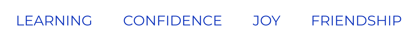
Additionally, I incorporated United Pals' motto, 'Learning, Confidence, Joy, Friendship,' into various design elements. These words became key text elements, such as typography stickers, reinforcing the core values of the brand.